Accessibility options for Floating Action Buttons

Floating Action Buttons (FABs) have gradually become a mainstay of modern UI design since they first appeared as part of Material Design ten years ago.
In the most part, FABs make a lot of sense — particularly when used as Google originally intended: to be used for the primary action of an application screen (i.e. ‘compose’ on Gmail). They’re prominent, and always in reach of your right thumb.
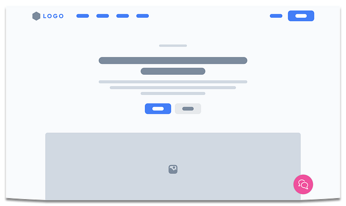
However, like everything in design, things evolve: FABs are now more commonly associated with help or contact mechanism on websites, to the point where it’s become the norm. In the old days, you’d look to the top right for a phone number. Now, you look bottom right for chat or help. Right?
But there is one aspect of FABs (or any ‘floating UI, for that matter) that I’ve become increasingly more aware of — how do they work when navigating with alternative inputs, i.e. not using a mouse or touch screen?
FAB Accessibility
There are several accessibility considerations at play when adding FABs, not just keyboard navigation.
One of the trickiest aspect is colour contrast — maintaining a 3:1 colour contrast ratio is very challenging when the button doesn’t always sit on the same background!
There’s also the reliance on iconography, too. More often than not, help or chat FABs tend to feature a question mark or speech bubble icon respectively. Now, whilst this icons may be synonymous with their respective topics and clearly signify the need, a text label is always going to improve the users experience and remove doubt.
There are positives, to FABs, too. Using FABs as a help mechanism does come with an accessibility benefit, courtesy of the new “Consistent Help” criteria introduced with WCAG 2.2. The aim of this criteria is to ensure that help is easy to find, and having a big bright button in the same place on every page seems to be a massive tick in that box!
The Keyboard challenge
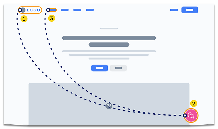
When navigating with a keyboard, or using a screen reader, the flow of content is — to an extent- governed by the site. The content flows from top left, to bottom right (unless you’re on a RTL website).

Floating content, such as FABs, don’t follow this rule. As they are absolutely positioned, where they visually appear on the screen can differ from where they sit in the content flow.
More often than not, they are the last piece of code to be rendered on a screen, either because:
- They’re visually the last thing in the design, so that’s where the developer has opted to put it in the mark up, or
- The FAB is a third party-provided widget that is injected using JavaScript, and renders at the end of the page by default.
I’m not saying that having a FAB render at the end of a page is always abad thing — but that’s mainly because it is unclear what “good” looks like. There are two obvious consequences to be aware of:
- Keyboard/alternative input users will have to navigate all the way through the rest of your content to get there, and
- Blind screen reader users, and may not know it even exists.
There are considerations that can be made that could make things better for those who use screen readers or alternative inputs. However, before getting into these considerations, I need to stress:
- These are just ideas — you should always test assistive tech solutions with actual users.
- These are based on web only, not native apps.
I also don’t want to get drawn into the “should you use FABs at all” discussion, whilst I appreciate it is 100% valid.
Option 1: Do nothing
It’d be remiss of me not to include this, because rendering the FAB at the end of your page *might* be the right thing for you, or your only option.
Yes, it may mean that your users have to tab through each link on your page to get to your FAB, but depending on how much content you have, this might not be too much of a bind.

Also, if your user is aware the FAB is there, they can navigate backwards [shift + tab] when the page loads to get to the link ‘first’. This may not be much use for blind screen reader users, mind, as they wouldn’t be able to see that the FAB is there to navigate to in the first place.
Pros:
- Not necessarily terrible
- Can be quickly accessed using shift + tab
Cons:
- Keyboard/Alternative Input users have to tab through everything.
- Blind users won’t know it’s there.
Option 2: Duplicate link
This option is a slight improvement, and quite common.

Duplicating the destination of the link or the action of the button elsewhere on your page, to somewhere that is more accessible, will enable people who struggle with the FAB to navigate to the content a second way. For example, including “help” in your top level navigation, as well as in your FAB.
Whilst this option is more accessible, it’s not really inclusive. If you’ve made a conscious decision to make whatever is in your FAB prominent, this should really be to everyone.
Pros:
- Easier to navigate to using keyboard/alternative input or screen readers.
Cons:
- Not really inclusive.
Option 3: Change tab order
You can change whereabouts in the flow the FAB appears by altering the HTML of the page. Using this approach, you could place the FAB where you think is best. For example, after your logo, or after your main navigation, for example.

Whilst this may improve the experience for screen reader users, it does also have drawbacks.
For sighted keyboard/alternative input users, this could be quite disruptive, as the focus will likely jump from the top of the page, down to the bottom, then back up again.
Also, if you’re not actually wanting to interact with the FAB but have to tab past it on each page, this could get frustrating.
Pros
- Can be accessed quickly using Keyboard, Alternative input or a screen reader
Cons
- Could be disorientating to sighted users
- Might get annoying for users who don’t want to interact with the FAB
Option 4: Skip link
My preferred option.
Call me a purist, but if the FAB is positioned in the bottom right hand corner of the page, then having it rendered at the end of the page feels honest. But we can make it easier for screen reader/alternative input users to get to it, in the same way that we make it easier to bypass the navigation of the site: by using a skip link.
Hopefully you’ll be familiar with skip links as you’ll already have one to satisfy the Bypass Blocks WCAG criteria. But if you’re not, a skip link (or skip to content link) is effectively an “invisible” link at the top of a page, that allows a user to jump to somewhere else on the page. They become visible when screen reader or alternative input users give them focus — usually by tabbing into the page. They’re most commonly used to allow people to bypass a sites navigation, but they can be used for other things too.

By using the same technique, you can introduce an additional “Skip to [FAB]” link (i.e. “Skip to Help” or “Skip to Chat”) that appears directly after your existing skip links. This method would give your users a consistent way to reach the content of your FAB, whilst providing minimal disruption.
Or, if you wanted to reduce the number of keypresses, the new “skip link” could even launch the action that is in your FAB — so instead of “Skip to Chat”, it would be “Launch Chat”.
Pros
- Graceful approach, using recognised pattern for users of assistive technology
- Doesn’t disrupt the logical flow of the page
Cons
- May not be immediately obvious until a user has focused on the skip link for the first time
Summary
Like many aspects of accessibility, there isn’t a universal best-in-class option for everything. “It depends”. These are ideas to improve the experience, but — and I can’t stress this enough — you won’t really know what is best until you test your ideas with assistive tech users.
Hopefully this has given you some food for thought about how you can make your next floating UI element as inclusive as possible.
Footnote
Photographs are from either Unsplash, and my own. Illustrations have been created using the Lookscout Design System Low-Fi Wireframe Kit in Figma.
